Editorial Content Series
Increasing engagement, brand impression, and sponsorship opportunities with a new experience for editorial content series.

THE TEAM
My role: Lead product designer
Product team: Product Manager, Engineer
Key stakeholders & collaborators: Editorial design, Product Marketing, Marketing, Editorial, Data Analytics
THE GOAL
Healthline, Greatist and MNT had great editorial content that was written in the format of a series, but there were no page templates for editorial to publish them on that could represent the series properly.
The series articles were currently being published in a regular article template, with no consistency on how the series was represented in the content or artwork, and no real way for the reader to find more content within the series other than inline links manually placed by the editor.
We set out to build an experience that would connect the articles within the series and display the content in a way that showed it was special and unique.
We wanted to increase engagement within the series and create a more memorable brand impression, while also creating a product that was differentiated from our sponsored programs (collections of articles around a topic, usually a condition) for additional sponsorship opportunities.
MEASURING SUCCESS
We planned to measure the success of our UX improvements as:
Engagement inside a series - measured with average session duration, page views per visit, and click rate on navigational elements
New high profile writers writing for Healthline
Subscriptions
Content series sold
IAB ad impressions + logo impressions
TIMELINE
Most of the work for this project was done in Q2-Q3 2020, with reskinning for the other brands being worked on in Q1 2021.

CHALLENGES
Defining a series
As we started our competitive research and started gathering existing content collections on our sites, we realized that there were gray areas when it came to what a series actually was. So we wanted to define what is and isn’t a content series.
Limiting scope for creating content and artwork for each series
We needed to balance making the page look elevated and special, while avoiding creating a huge workload for each series that would be published, for editors and illustrators. We also planned to create guidelines to streamline future processes for content series creation.
Competing for advertising clients with big players
Creating content series for non pharma clients would put us in competition with big players like Conde Nast.
Collaborating remotely during the pandemic
This project was kicked off in the early summer of 2020 when while we were adjusting to fully remote work and dealing with the stress and emotions of the the pandemic.

Competitive research
We looked at the competitive landscape to see how other sites distinguished between series and other types of content collections, and how they made series discoverable throughout the site. We looked at how competitors tied the experience together and made it feel branded.
We found that most sites had a lot of overlap in the UI for the different types of content collections ,and that visually branding the series was common.
User interviews
The product manager conducted 10 interviews with users who regularly watch or read a series such as Crash Course on YouTube, Money Diaries on Refinery29, The Upshot on NYT, and The Daily Skimm newsletter. The main takeaway was that a good personality in a series is often key.

Defining a series
Referencing articles on our sites (Healthline, MNT, Greatist) and other sites such as Refinery29 and New York Times, we brainstormed around what a series actually is, especially compared to other groupings of content such as collections, programs, categories, subcategories and tags.
We didn’t want just any collection of articles to be published in our new special template to prevent it from losing its impact.
We decided a series had to have all three of these requirements:
It couldn’t be a generic topic (something like “Mental Health” is a category, not a series). Something about the topic had to be unique and specific, such as the author voice, a niche topic, or an interesting format.
It had to have an editorialized title (something like “Crazy Talk” or “Anxiety Diaries”)
It had to be written with the series in mind (not curated based on a theme after it was written)
We also discovered through our research that there were two main types of series that we wanted to optimize a bit differently for:
Author-focused - The appeal of the series is the voice and/or expertise of the author, or even a celebrity
Topic-focused - The appeal of the series is the unique or interesting topic or format

From there we brainstormed ideas for the experience, prioritized them using ICE scoring (Impact, Confidence, Ease) and organized them by KPI to make sure we were meeting all the goals of the project.

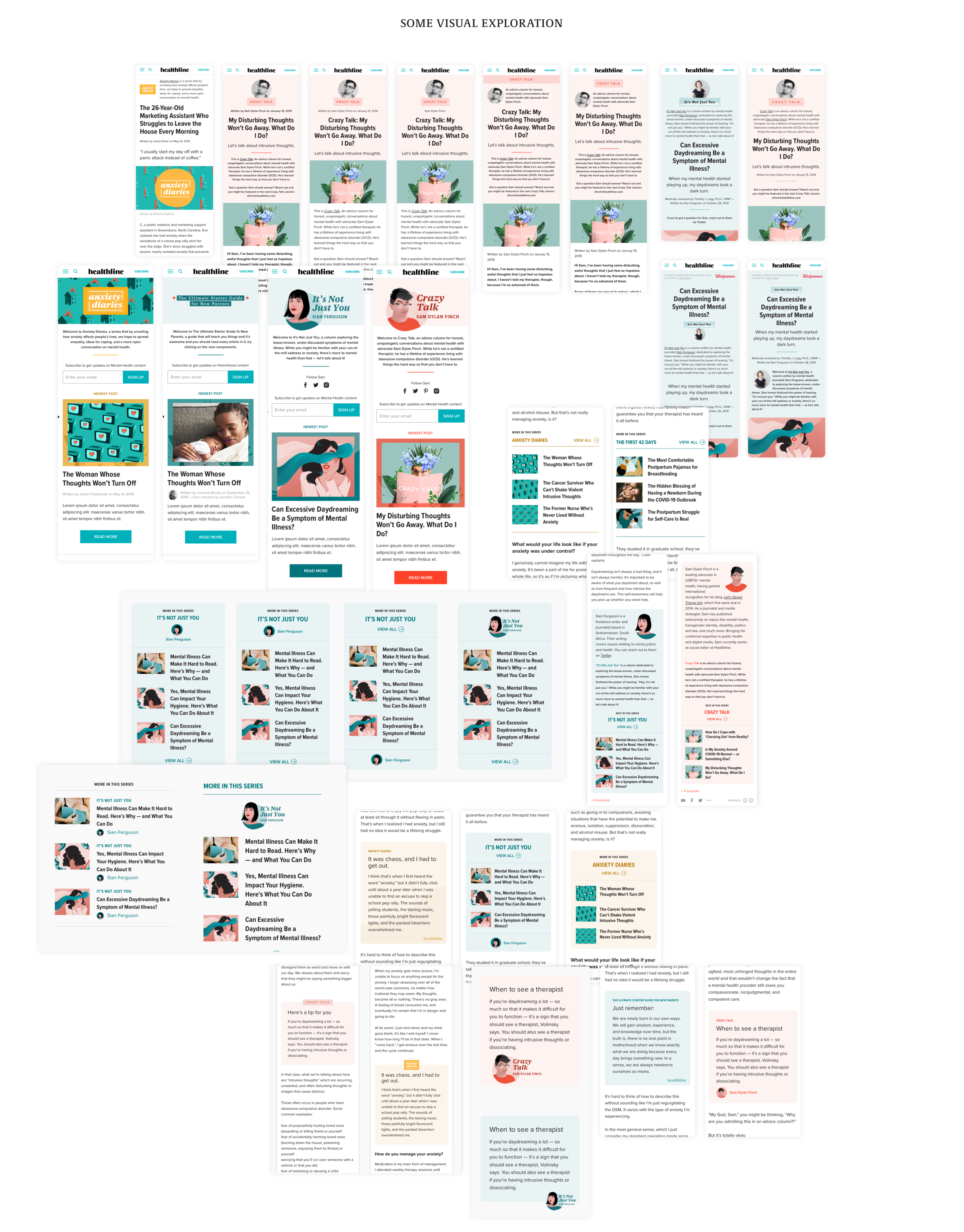
I did UI exploration to nail down how visuals could tie the series together and make it feel special. I collaborated with editorial designers to figure out how to incorporate a series logo and simplified icon into various elements on the page, and how the article artwork could pair with color schemes in the UI.

I explored visual designs for a hub page and the article page and narrowed down to options that were the most impactful, scalable and elegant. The final design included a hub page and an article page with a color scheme chosen per series, navigational elements and visual theming.


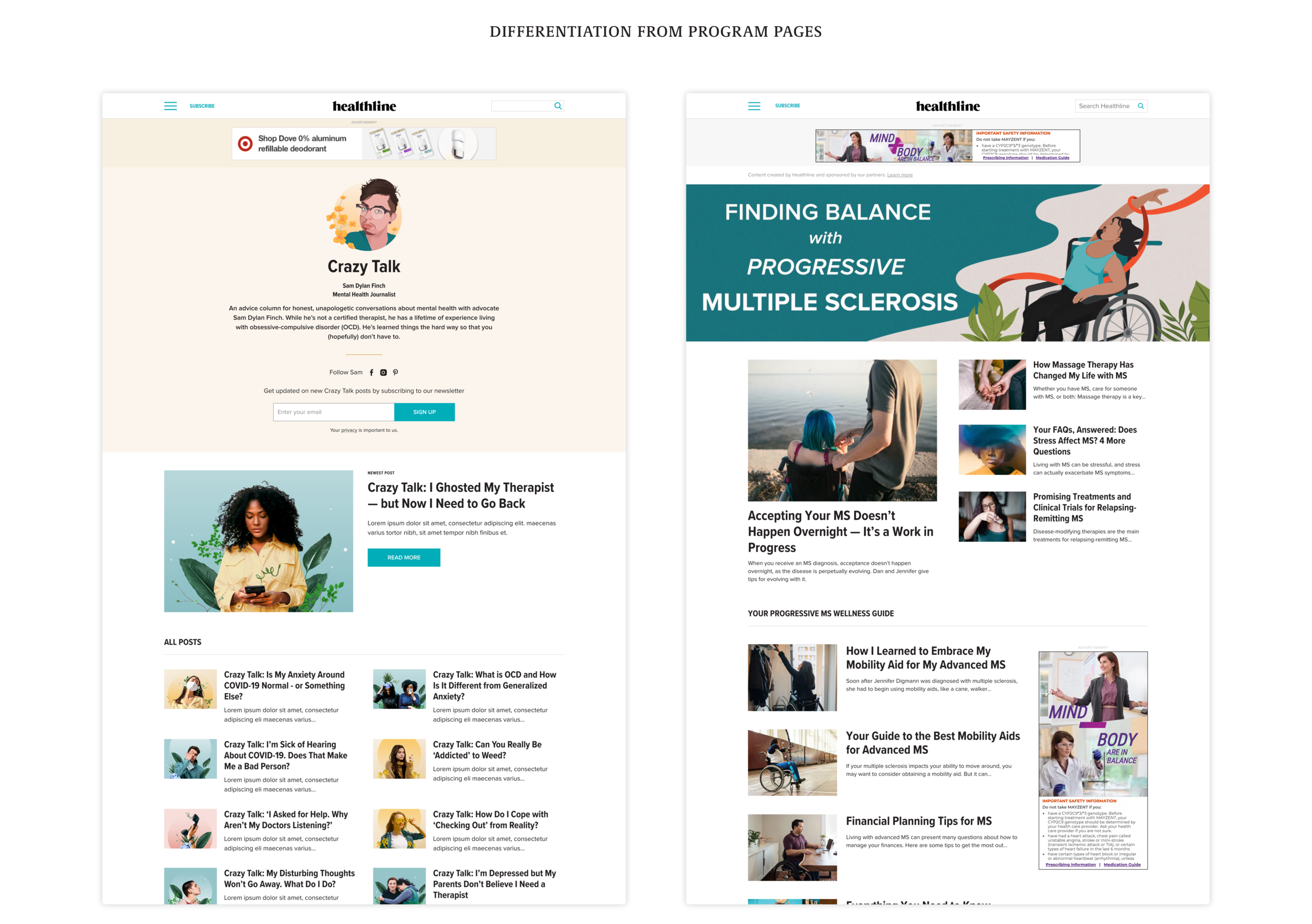
The design of the series hub page was meant to look much different from the existing program pages to help the sales team pitch it as an additional product to clients.

My handoffs to developers had to be organized since there were several variations and use cases in the page templates UI, and there were specific logic for the user of our CMS uploading assets and publishing the content. I made sure that all the naming was consistent in all documentation and that the guidelines I made for editors and designers matched up with what was in the CMS and in the UI.

I put together guidelines for editors and editorial designers for creating each series post, such as character counts, asset sizes and direction on artwork.

Results
Early data from four live series showed an increase in engagement - a 4% increase in Page Views Per Session. This metric has historically been difficult to increase on our site since most users search on Google, go to the article page, and then head back to Google. So a 4% increase is a pretty big win!
Average Session Duration remained the same, but we hope to publish more series and iterate on the design to continue increasing engagement.
The Sales team is excited about the new template and is pitching it. A current pain point is the editorial process and unpredictable traffic to the pages which is being worked on.

Credit: All illustrations and logos for these articles were done by illustrators at Healthline - I collaborated with them on the concepts for what to include as part of the template.
