


Satisfying users’ search intent on brand name medications, whether they’re looking for a general overview, as much in-depth info as possible, or just a quick answer to one specific question.
THE TEAM
My role: Lead product designer
Product team: Product Manager, Engineer
Key stakeholders & collaborators: Product Marketing, Editorial, Medical, SEO
THE GOAL
The brand name medication content on Healthline.com was identified as an opportunity to create more high-quality ad inventory for key advertising partners. So goal was to rank as high as possible in the search results for head term queries for brand drugs such as Otezla and Adderall.
To rank higher in a competitive space, the editorial team began rewriting and reorganizing the content, while the product team set out to improve engagement on the page once the user got there.
We knew that the medication content was overwhelmingly long and that researching medications could be anxiety-provoking. Our goal was to create a user experience that best gave users all the information they needed, whether they were looking for all the details, a quick overview, or a quick answer to a specific question.
MEASURING SUCCESS
We planned to measure the success of our UX improvements as:
User satisfaction - measured with NPS, other polls, and user interviews
Engagement - measured with bounce rate and engagement with navigation features
Organic traffic - SEO tests after articles are published
Avoid decreasing - ad viewability, ad impressions, average session duration, and scroll depth
CHALLENGES
Timing
Working on the user experience at the same time the content was being written meant collaborating with editorial and SEO and designing features without knowing for sure what the content would be. It also created challenges with SEO testing since new content tends to be unstable with traffic at first.
SEO writing tactics
The fact that editors were writing articles in a templatized way that was optimized for SEO made the content a bit strange.
One tactic was to write articles that were 5000+ words long in order to answer as many user search queries as possible. This makes an overwhelmingly long and disorienting article.
Another SEO tactic was to order the sections based on popularity of search term. This made the flow of the article feel disjointed. Some very specific and not broadly relevant sections you wouldn’t expect to be at the beginning of the article, such as “Interactions with Ibuprofen” would be at the top because it’s a popular search term. These types of sections would also get the same weight as a broadly relevant section which is confusing to read.
Another tactic that made the content potentially confusing to a reader was that popular search terms that were misconceptions got the same weight as facts. For example, for the medication Otezla, “cancer side effect” is a common search term because it is a common misconception. But even though the article explains that cancer isn’t a side effect of Otezla, the section title “cancer” is mixed in with the rest of the real side effects like headache and nausea.
The drug content space was very competitive.
It was going to be difficult to compete with RxList, Iodine, Drugs.com and other sites with this type of content.
We started our research by asking 10 participants to research their medication on RxList, WebMD and our sister site, MNT. Credit: Product Manager conducted this research and gathered insights.
Then we interviewed 10 people who were either actively taking Humira, Otezla or Tecfidera (some of our top advertising partners) had already taken it, or were about to take it.
We asked them about themselves, their conditions, and their experience with turning to the internet to learn more about their medication. The interviews provided insights about the different mindsets of people who research a medication. Credit: I sat in on interviews that the Product Manager conducted and we collaborated on gathering insights.
SUMMARY
Our main learning was that the way people researched medications varied a lot depending on where they were on their medication journey and their personality type.
So we categorized these research styles into three “mindsets.” We mapped the mindsets to the medication journey, and then ran Hotjar polls on existing drug articles to find out how the traffic on our site matched up.
The poll results showed that although there were slightly more “Quick Search” users that were “taking the drug for at least one month,” the mindsets and points on the journey were pretty evenly split. This meant we had to decide how to create a UX that could solve for all mindsets at once, or to focus on one.
We started mapping out some features that were specific to mindsets.
When we confirmed that there were different solutions for each mindset, we started organizing our ideas and brainstorming the ideal UX for each mindset, without limiting ourselves to try to make it work for all of them yet.
We looked at competitors sites such as medication content sites and sites with features that we had started ideating around, especially navigation and side effect deep dives.
We wireframed our top ideas into three distinct layouts based on mindset and tried a fourth that was a mashup.
We prioritized our feature ideas using ICE scoring (Impact, Confidence, Ease).
I explored potential visual/UI designs around navigation and side effect deep dives.
We knew we wanted to improve navigation because it showed up in our competitive research, our user interviews, and was an issue for all 3 mindsets. We also felt intuitively that this was what was most noticeably missing from our existing UX.
After presenting to the executive team our progress and getting buy in on testing our ideas, we branched into three test plans:
Test #1 - User reviews of side effects
We wanted to validate user value with some user testing in order to make a decision about a potential integrations with a reviews site. This feature would be for Emotional Prep mindset.
Test #2 - Side effects incidence
We knew users would benefit from more information about how likely it is for certain side effects to occur. If you’re about to take a new drug, seeing a long list of side effects is concerning without the knowledge that a lot of them have a very low incidence rate. What we weren’t sure about was how well this would perform in ranking for the search term, since it would be only for Quick Prep and Emotional Prep mindsets.
Test #3 - Navigation and byline features
We knew we could earn the user’s trust by emphasizing the expertise of the article in the byline. The articles were written and reviewed by Pharmacists with a Doctorate in Pharmacology (a PharmD), but that was easily missed in the current design. This would help with SEO due to a recent Google algorithm update, and, we hoped, also improve engagement.
We were confident that improving navigation and organization of the page would help users with all mindsets find what they were looking for.
We wanted to build the page template in a way that could be used for other articles on the site that were long and disorienting and wouldn’t always be read from start to finish.
To help explain this use case, we decided to name it the Reference Template.
Mindset: Emotional Prep
We launched an SEO test on the site using mostly existing components. There wasn’t enough of a traffic boost to pursue this feature since it would require acquiring or partnering with a reviews site or building out reviews functionality. Credit: Product Manager conducted user interviews.
Mindset: Emotional Prep, Quick Prep
We used clinical trial data to add side effects incidence to some of the drug articles. We SEO tested it and interviewed users. Credit: Product Manager conducted the interviews and gathered insights.
Test results: Users found it valuable in user interviews, but the SEO test showed a dip in traffic.
Our hypothesis was that it took up too much space or disrupted the side effects section (which was a hugely successful section for Google searches) in some other way.
TEST #3 - NAVIGATION AND ORGANIZATION
Mindset: All mindsets
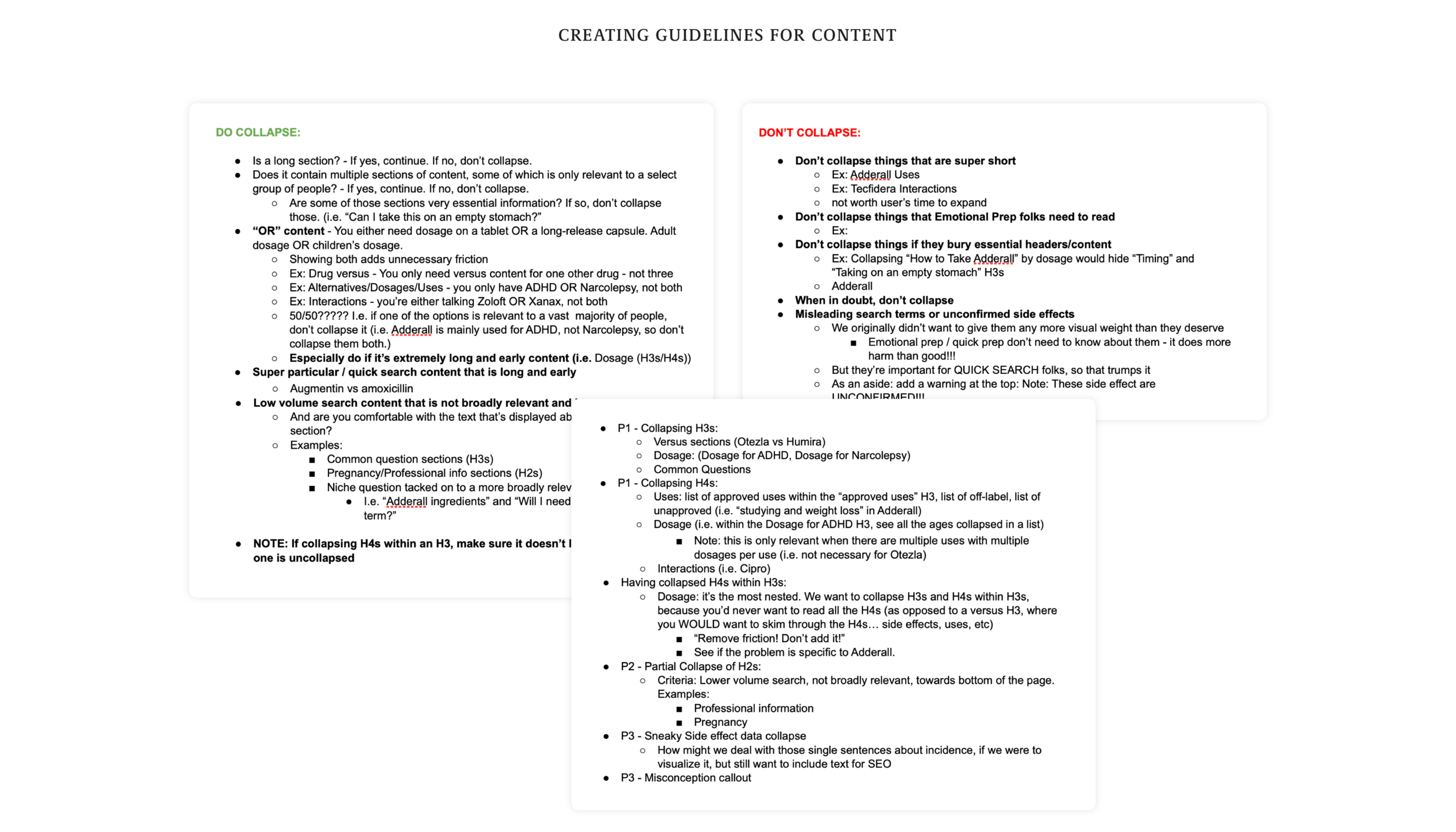
While building a redesign of the top of the page, collapsing features, and a sticky navigation, we worked on thinking through the best way to collapse content.
Collapsing content was tricky because we were trying to remove the friction of scrolling by collapsing, but if too many sections were collapsed it would add MORE friction to open them. There was a balance that needed to be thought through per article, so we collaborated with editorial to create guidelines documentation.
We launched a v1.0 that included all features except collapsible sections, and then later launched v1.1 which included them.
Test results:
v1.0
Slight increase in overall traffic
Ad metrics were mostly neutral (which was what we were going for)
Engagement metrics were nearly 2x on jumplinks
v1.1
Slight decrease in overall traffic
Some sections lower on the page did rank better
As always, our hypothesis was that collapsing some content hurt our ranking since Google tends to read collapsed content as less important.
User testing
We rolled the template back to v1.0, and did un-moderated user tests comparing the original template to the new one. Users found the new design much better.
Unprompted, most users cited reasons they preferred the new design as being easier to navigate and visually easier to process.
“…it offered me a way to navigate effortlessly between sections, without a lot of scrolling. Visually, the topics in the article felt more separated and easier to visually digest…”
“…breaking up the different sections of the article it became incredibly less overwhelming to read. The menu that stayed at the top of the page was also very useful in such a long article!”
They rated their satisfaction with the control vs new - average satisfaction score was 6.8 / 7 for the new vs 5.7 / 7 for the control.
Migrating to MNT
We later found that the medication content in general performed better on our other site, Medical News Today, so we migrated all the content to that site and reskinned the template from Healthline to MNT.
We designed a super-collapsed version for MNT that we ended up never testing (we had moved on to other focuses by that point.) Credit: MNT designs were executed by another product designer who I was managing.
Disclaimer: While the medication information in the screenshots is based on real content, some of it has been changed for presentation purposes, so none of it should be considered accurate medical information.